My writings about baseball, with a strong statistical & machine learning slant.

Monday, February 15, 2010

Fastballs for dinner?

This post is over due.

A few months ago, I invented a new statistic to measure the depth of a pitcher's repertoire. Using such a statistic, we can say which pitches a particular pitcher relies on. Then, we can show which pitches are used by what percentage of pitchers, within the major leagues. That is what I am going to show below.

You may ask: is this different from graphing how many pitchers throw a curve at least 10% of the time? Yes, it is. Let me explain repertoire depth with a couple of examples. Or you can just skip ahead to the graphs.

-----

Take Rudy Seanez. In 2007, he threw 76 innings for the Dodgers as a right handed reliever, posting a 3.79 ERA with 1 save. According to FanGraphs pitch data, his pitch distributions were as follows:

pitch:% thrown:
FB53.0
SL31.6
SF13.0
CH2.3

This distribution translates "2.17 depth from 3 offerings."

Offerings is a sort of upper bound on the pitcher's repertoire, while depth is a lower bound. Intuitively, the number of offerings would correspond to how many pitches a hitter should look for, while depth is a measure of how many core pitches a pitcher has. You can see the details in my original post (I'm looking at the harmonic mean of the pitch percentages). But basically, any pitch ranking lower than the number of offerings is something that the pitcher throws too rarely for us (or the hitter) to care about. While depth is a way to rank pitchers in order of their repertoire depth.

Still confused? Let's take a look at another example. Mariano Rivera is the best one-pitch pitcher in baseball. Here is how his repertoire broke down in 2008:

pitch:% thrown:
CT82.0
FB18.0

That's it. He throws a lot of cutters, and also some fastballs. I have him at 1.18 depth from 2 offerings. The truth is a little bit more complicated, since I am not considering pitches thrown to RHBs and LHBs separately. Dave Allen shows that Mariano actually throws both cutters and four-seam fastballs to RHBs, but only cutters to LHBs. Then again, I don't know where to get pitch data splits for years before 2008. And I would major small sample issues.

Contrast Mariano's repertoire to that of Roy Halladay's from 2009:

pitch:% thrown:
CT41.5
FB31.7
CB22.2
CH4.6

According to my system, his repertoire has 2.81 depth from 3 offerings. Somehow that sounds efficient, right? You don't need know a harmonic mean from a harmonica to see that the talented Mr. Halladay throws three pitches, with pretty much equal likeliness. So he's got 3 pitches, each of which are a "core pitch" for him.

----

Let's get back to those graphs I promised. For each pitch that FanGraphs catalogs for us, I count how many pitchers include that pitch in their offerings. That's simple enough. I look at his top X pitches, where X is that pitcher's number of offerings.

I do the same thing for a pitcher's repertoire depth. Roy Halladay has a depth of 2.81. Round that to 3. So we take his top 3 pitches. His three core pitches (cutter, fastball and curve) all count. Rudy Seanez (of 2007) has a depth that rounds down to 2, so we take his fastball and slider as core pitches. His splitter is #3, so it counts for offerings, but not for depth. The breakdown for Mariano is simple.

-----

If we perform the computations above for all pitcher season from 2002 to 2009, we can get a count of how many pitchers use each pitch, and how many pitcher use each pitch as a "core pitch."

We can also compare how these pitch distributions differ between starters to relievers. We all know that relievers' repertoire depths are smaller than those for starters. But how are they different? Which pitches do relievers rarely throw?

Here are the graphs. Each pitch is shown as a percentage of pitchers who include it in their offerings, and a percentage of those who include it in their depth.


And here are just the lefties (starters & relievers):


For those who love small samples, here are the lefty starters (still 318 pitcher seasons):


Alternatively, I have the same data in chart form. First, the pitches by offerings:

pitch:% of pitchers:% of starters:% of lefties:% of lefty starters:
FB99.699.399.9100.0
SL72.570.872.763.2
CT8.114.27.718.2
CB49.566.750.767.6
CH59.877.668.089.0
SF8.110.21.22.5
KN0.51.100
pitches2.983.403.003.41

And similarly for depth:

pitch:% of pitchers:% of starters:% of lefties:% of lefty starters:
FB99.399.099.9100.0
SL43.840.243.126.4
CT4.37.53.911.3
CB22.431.323.631.1
CH22.228.132.047.8
SF3.14.20.30.6
KN0.51.100
pitches1.942.102.012.19

Well that's a lot of numbers. You can draw your own conclusions, but a few things stick out to me:
  • Starter do indeed throw more different pitches than relievers. On average, they have about 0.5 more offerings, and 0.5 more depth. Starters are more likely to use each of the different pitches than relievers. The exception is sliders. Relievers are more likely to rely on their slider than starters
  • All pitchers rely on their fastball.
  • Lefties throw the same pitches as non-lefties. Except that lefties are more likely to throw change-ups, and lefties almost never throw splitters. Then again, the change-ups could be a classification issue, since lefties tend to throw less hard than righties.
This article is long enough already, so I'll stop here. If you would like to see something else, please let me know.

Wednesday, February 10, 2010

Why strikeout rates from pitch data are interesting? (Part 2)

In Part 1, I showed that information about pitch data, bio data and league (AL vs NL) is helpful for predicting strikeout rates, but not as helpful as simply looking at the swinging strike rates. So then why should we care about predicting strikeout rates from pitch data and bio data?

I don't need to explain why predicting strikeout rates is important. But I will do so anyway. Bill James has written often (behind the pay wall) that strikeout rates are a good predictor of how likely a pitcher is to be effective in the future. There has been a trend toward higher strikeout rates for many years, and effective pitchers who don't strike people out are a dying breed. Bill James suggests that this trend will only continue. Thus it is important for teams to develop high-strikeout arms for the future. This is not to say that other factors of a pitcher's performance are not important. But strikeout projections are very important for a prospect's value to a club.

This is why I am focusing on non-performance related factors in predicting strikeout rates for major leaguers. I have never spoken to an MLB scout and I don't know much about minor league stats. But I think that the factors that I am looking at might be easy for a scout to project.

I am looking at biographical factors like:
  • handedness
  • height
  • weight
  • age
These will not change for a prospect, or at least they will change very predictably.

My pitch data includes factors like:
  • how fast is his average fastball?
  • how often does he throw it?
  • how often does he throw a breaking ball?
  • what's the speed differential between his fastball and change-up?
  • how deep is his repertoire (using a statistic that I invented)?
Also, I use:
  • IP (innings pitched), but only to allow the model to differentiate between starters and relievers.
  • league (NL vs AL), but mostly to adjust for that fact that NL starters face the opposite pitcher, and thus have slightly higher strikeout rates that have nothing to do with ability.
  • YEAR (as an number), to factor out yearly trends. However, this is almost always ignored by the model, in any case.
None of these features consider the player's results-based stats from the major league level. Also, I think that a scout could predict all of these features, at least within a range.

I would like to see my model translate a pitcher's scout projection into a projection of his future strikeout rate. And I think it can.

Say you've got Joe Dirt. His fastball sits at 92 mph, and touches 95. He's got a plus change-up, and a below average slider that he can become MLB average if he works on it. He projects as a starter. Oh yeah, and he's a lefty. Sounds like one heck of a prospect. But can we project all of that information to a MLB strikeout rate? With my model, it is possible.

Furthermore, my model should even be able to place error bars on the output. In previous posts, I have discussed how variance in predicting strikeout rates is related to IP. In a more recent post, you can see how my prediction accuracy changes by fastball velocity.

With more data and more time, I should be able to not only predict a pitcher's strikeout rate reasonably accurately, but I will also be able to say how confident I am in that prediction, based on his fastball speed, his handedness, and whether or not he throws a slider.

I would hope that such a system would be useful to scouts, and to the teams that employ them. If you are reading this and you own or run a major league team, feel free to email me. Despite the name & references to Mother Russia, I am a baseball-loving American citizen. Originally from Russia.

The system does have limitations, not least of which is the fact that my entire sample space is guys who've made the majors. I have no data on 95 mph lefties who never got to AA. I know there is much more to pitching than being a hard throwing lefty.

----

The swinging strike study (showing that swinging strike rate is very highly correlated to strikeout rate) uncovers some valuable truth, and this is not a criticism of Jeff Sullivan's work. However I'm doubtful that swinging strike rates observed at lower level will matter much for predicting those same rates at the major league level.

My own baseball career topped out at around 12 years old. I was a good Little League pitcher. I didn't throw too hard, but I got plenty of swing-and-misses from guys chasing my slow "fastballs" outside, and my "sliders" in the dirt. There is no way that my crap would have worked in high school.

Why strikeout rates from pitch data are interesting? (Part 1)

Before I go into depth about the results my findings, I think that this is a question worth answering. Why am I trying to predict strikeout rates from pitch data an biographical information?

As Dave Allen pointed out to me (thanks Dave!), one can predict strikeout rates very well with swinging strike rates. So if the point is to find a way to predict strikeout rates independent of direct measures of performance (ie wins, ERA, VORP, etc), then my gig is up. However, this isn't the point.

The article from Jeff Sullivan (linked above) shows that there is a linear relationship between strikeout rate and swinging strike rate. His R^2 = 0.71, therefore implying that the correlation coefficient between these factors is 0.84. That is much better than anything I can get from pitch data. Which I don't think is surprising. I compare these values in more detail below.

Also it's notable that Jeff uses a 100 IP cutoff for his pitcher seasons. Therefore, he completely ignores relievers. I do not ignore any pitcher seasons, as I wrote about in several previous posts. However I include my results, training only on 100+ IP pitcher seasons, as a point of comparison.

predicting:correlation:model type:features:
SO%0.84linearswinging strike rate
SO90.59non-linearpitch type, bio, league
SO90.48linearpitch type, bio, league
SO90.37non-linearwithout fastball velocity
SO90.52non-linearfastball velocity only

As I wrote before, SO% and SO9 are extremely correlated (you can estimate one from the other with a linear transformation with very high accuracy). My resulting models for SO% and SO9 are almost the same (after a linear transformation), with the same correlations. I will switch to SO% soon. I promise!

A few things are clear from the table above:
  • Swinging strike rate is a much better predictor of SO% than anything available from pitch data (how hard does a pitcher throw, which pitches, and how often), bio data (height, weight, age, handedness) and the league in which he pitches.
  • I gain significant predictive power from using a non-linear model. If you want to see why, take a look at the graph of fastball velocity vs strikeout rate from my previous post.
  • Most of my predictive power comes from the non-linear use of the fastball velocity.
Although moving from 0.52 correlation to 0.59 correlation is significant, I must acknowledge that my model is not much more than a way to predict strikeout rates from fastball speeds, adjusted for handedness, league, age, and a few other factors. Then again, I need to re-iterate that my full model takes into account all pitcher seasons with less than 100 IP, while these models are restricted only to full time starting pitchers.

In case you are wondering what it means for my 'other features' to predict strikeout rate at a 0.37 correlation, here is an amusing parallel. If I want to predict the year in which a certain pitcher season occurred, using the same data, I get a similar correlation:

predicting:correlation:model type:features:
YEAR0.32non-linearpitch type, bio, league

My data consists of pitcher seasons 2002-2009. There is equal distribution of pitcher seasons among these years. The year is treated as an number, so the model gets credit for getting close to the right year, etc.

So one can predict the year that a certain pitcher season took place using a few trends in pitch data and biographical composition of the pitchers. Again, note that all pitcher seasons are for 100+ IP. The most significant features (roughly in order of importance):
  • Cutter %: Pitchers throw more cutters than ever before. However, this may also reflect a bias in the classification of pitches as cutters over time by BIS. This only affects pitchers who throw cutters, whoever, who are still in the minority.
  • Fastball velocity: Average fastball velocity among starters has steadily increased for the last decade.
  • Repertoire depth: This is a statistic that I invented to measure how many pitches a pitcher has in his arsenal. Over the last decade, starters have developed more balanced repertoires. In other words, they throw their second & third pitches at a percentage more in balance with the percentage of fastballs thrown.
  • THROWS = L: There are more lefty starters now than there used to be.
  • not SO9: I allowed the model to use SO9 as a feature, but it did not find it useful to predict the year, at least not after the above factors are considered.
All of these factors add up to a 0.32 correlation with the year of the pitcher season. I thought that was an interesting list, so decided to share.

For those of you who care about details, here is how the model above (predicting pitcher year) looks like:

Rule: 1
IF
CT_fg_per > 0.05
CT_fg_per <= 9.15
THEN

YEAR_BIT =
0.0082 * THROWS=L
+ 0.0816 * HEIGHT_OVER_6ft
- 0.0004 * WEIGHT
+ 0.0359 * AGE
- 0.1365 * LG
- 0.0011 * FB_fg_per
- 0.0017 * SL_fg_per
+ 0.0657 * CT_fg_per
- 0.017 * CB_fg_per
- 0.019 * CH_fg_per
- 0.0028 * SF_fg_per
+ 0.074 * FB_fg_vel
- 0.0307 * SL_fg_vel
+ 0.0135 * CT_fg_vel
- 0.0024 * CB_fg_vel
+ 0.0012 * CH_fg_vel
+ 0.3186 * rep_depth
- 0.0047 * rep_offerings
+ 1999.0137 [314 instances]

Rule: 2

YEAR_BIT =
0.3793 * THROWS=L
+ 0.0581 * HEIGHT_OVER_6ft
- 0.0401 * FB_fg_per
- 0.0415 * SL_fg_per
+ 0.0217 * CT_fg_per
- 0.0919 * CB_fg_per
- 0.0638 * CH_fg_per
- 0.1114 * SF_fg_per
+ 0.2177 * FB_fg_vel
- 0.0356 * CB_fg_vel
+ 0.034 * CH_fg_vel
+ 1.5547 * rep_depth
- 0.2658 * rep_offerings
+ 1987.7999 [816 instances]

Saturday, February 6, 2010

Strikeout rate predictions by IP buckets (visuals)


I retrained my SO9 prediction model after scaling pitcher season weights in reverse proportion to the SO9 variance implied by IP. See the previous post for an explanation of how I did this.

The model did not change much. That is good. After many iterations of training, my model has stabilized. It is now consistently splitting the pitcher seasons into three similar sized buckets. But more on that in the next post. For now, I quickly want to explain the graph above.

----

After breaking down my 5,017 pitcher seasons into 5 buckets by IP, I graph the scatter plot for actual vs predicted IP in the 5 series. Also, I graph the trend lines for each data subset.

The graph is a bit messy, but one thing is clear about the five distributions:
  • The series for [+∞, 116], [116, 65] and [65, 39] IP have similar distributions
  • The series for [14, 0] IP shows that my model has very little ability to predict SO9 rates for that series
  • The [39, 14] IP series is somewhere in the middle, but closer to the first three series. So I can predict these strikeout rates somewhat well, but still much worse than those with 39+ IP.
This observation reflects the variance estimates from the previous post. Again, my new model has almost exactly the same weights as before. However since the pitcher seasons in the [14, 0] IP range have between 10 and 100 less training weight than the 200 IP pitcher seasons, the new model claims a higher correlation with the data set. I think this makes some sense.

Before I scaled pitcher seasons by inverse SO9 variance estimates, the correlation between my model and the data would swing between 0.6 and 0.4, depending on how much of the lower-IP pitcher seasons data I included. Now, the correlation stays a little below 0.6 (0.5467 in the latest model), regardless of how much of the lower-confidence data I include.

Over the several models that I trained, my ability to predict SO9 for higher-IP pitcher seasons has remained the same. However, models that are trained on 40IP cutoffs, 20IP cutoffs, etc, do very poorly in predicting IP for the pitchers with very low IP.

Therefore now, I can train on all the data, predict SO9 as well as I can for pitcher seasons of all IP, and yet not have the noisy low-confidence data make my correlations look artificially bad. So I'm happy. Now I can move on to something more interesting, like looking at the model that I'm producing more closely.

-----

While you're looking at the graph, there is one more observation worth noting:
  • Even for high-confidence (high IP) data, my model consistently fails to predict high-strikeout seasons.
First of all, is this really the case? Let's zoom in to the graph for all high strikeout pitcher seasons. To avoid low-confidence points, I only plot the three series for pitcher seasons with at least 39 IP. Also to get some context and to avoid multiple-endpoint statistical traps, I plot the top 1/3 (by strikeout rates) of all those pitcher seasons. The cutoff ends up at 7.42 SO9:


As the trend lines show, my model does indeed tend to under-predict high strikeout pitcher seasons. My under-predictions increase steadily as actual SO9 increases. I especially under-predict the really high SO9 seasons.

The SO9 >= 10.0 seasons represent 19.3% of the seasons show above (which in turn represent the top 1/3 of all pitcher seasons with significant IP). So the high-strikeout pitcher seasons form a small (1/15) but significant part of my data set. If strikeout rates fluctuated wildly from season to season for individual pitchers, then this would make sense. However, intuitively we know that this is probably not the case. Pitchers like Eric Gagne, Brad Lidge, and others (see previous posts for a complete list of high-strikeout pitcher seasons) show that the ability to record exceptionally high strikeout rates is a repeatable skill.

Figuring out why I fail to predict these high-strikeout seasons is beyond the scope of this post. However I suggest some ideas why this could be the case:
  1. Exceptionally high strikeout totals can not be predicted only from pitch data.
  2. Relationships between pitch data and strikeout rate are not linear, therefore my piecewise-linear solutions are bound to under-estimate outputs for high-end inputs.
  3. The algorithm I use to generate my models performs a smoothing operation in the data. Perhaps I am losing something valuable because of the smoothing of what look like outliers.
All three explanations make sense to me. However two of them are pretty easy to look into.

----

I retrained my model with smoothing turned off. No difference. I trained a model that only looks at fastball velocity and pitcher handedness. Again, turning off smoothing made no difference. So scratch explanation #3.

Reason #2 was a bit harder to evaluated.

First of all, I need to re-iterate that the average fastball speed (FB_fg_vel as I referenced it in early posts) is the single most predictive feature that I have. There is a 0.22 correlation between observed strikeout rate (actual SO9) and fastball speed. If I train a piecewise linear model with this single feature, I can get a correlation of 0.48. So actually, my model for predicting strikeout rate from pitch data is mostly a model for predicting strikeout rate from fastball speed.

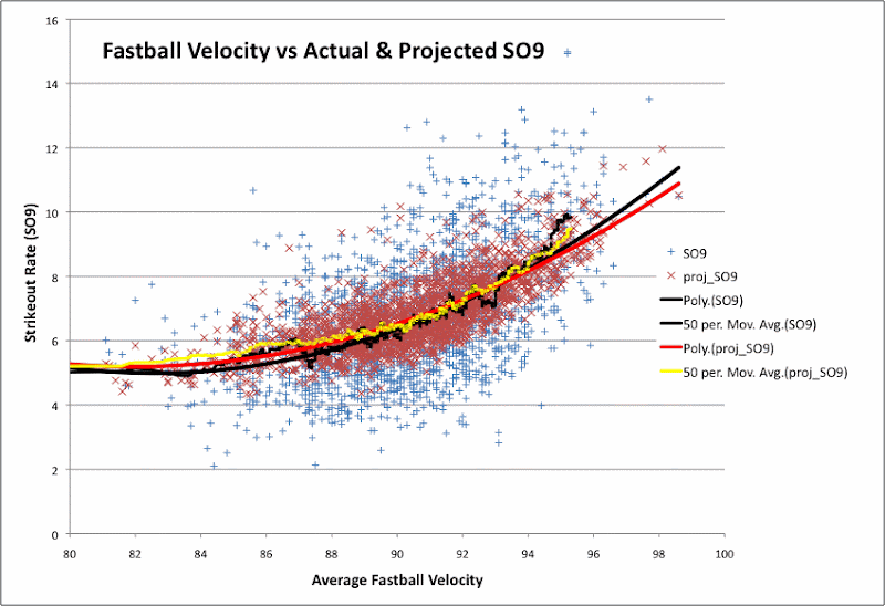
Below, I show the relationship between fastball speed and observed strikeout rates. Also I plot my predicted strikeout rates. To make the graph less cluttered, I only plotted data from pitcher seasons with 65+ IP.


Along with the scatter plot for real and predicted strikeout rate, I also included:
  • a trend line for the data, fit to a quadratic function
  • a 50-point moving average of the strikeout rate (ranked by fastball speed)
Again, you can see that my predictions are much lower than actual strikeout rates for pretty much all the high-strikeout pitcher seasons. There are quite a few blue points in the top right section of the graph (>92 mph, >10 SO9) that the red points don't reach at all.

However, the trend line for my predictions and the trend line for the actual values do not differ by much, even at the high end of the fastball scale. At most, my quadratic of best fit is 0.5 SO9 below the quadratic for the actual values. The 50-point average seems to jump up for the actual values somewhere around 95 mph. But the jump isn't big enough to be sure if it's significant.

This all leads me back to reason #1. I do not have the features in my model, in order to predict really high strikeout rates. Also, I'm pretty sure I won't get there by looking at the average fastball speed on a different scale. The answer could be hidden in something I already have (but I don't present properly to the model), like the speed differential between a pitcher's fastball and change-up. Or it could be something that I haven't imported yet.

As always, the more I think I learn about baseball, the more questions I seem to raise to myself. But that is the nature of the beast.

Monday, February 1, 2010

Handling small sample sizes (K9 variance by IP)


First of all, thanks to Dave Allen for pointing out that I should be trying to predict SOr (strikeout rate as a percentage of AB) rather than SO9 (strikeout rate per 9 innings). However in practice, there is no difference. I can't give you linear a formula to translate SOr to SO9 offhand, but I can say that my machine learning system predicts them with the same accuracy (within 1% which is not remotely significant), using the same features, weighed in equal proportions. That said, Dave is right and I should be using SOr.

For the mean time, I will stick with SO9, knowing that I can translate to SOr as needed. I understand strikeout rates per 9 innings much better than I understand strikeout rates per batter. I imagine other people do as well. Seven K's per 9 innings is average. Anything around nine per nine innings is very good. Anything above that exceptional. In any case, thanks Dave. You are 100% right.

----

In my last post, I wrote about an idea I had for handling small sample sizes. Or rather, I wrote about training models intelligently with lots of data of unequal significance. I now have a much better example of this idea at work.

I have a data set of all pitcher seasons from 2002-2009, along with pitch data from FanGraphs, and the pitchers' observed strikeout rates. Also I have innings pitched (IP) for these pitcher seasons.

I would like to build an (optimal) model to predict expected strikeout rate (SO9) from the FanGraphs pitch data. However my data set includes data for guys who pitched 200 IP, and for those who guys who pitched 20 IP. Intuitively, these data points are not equally significant. However the 20 IP data points are not insignificant either! This is important since almost 20% of the pitcher season from the past decade are for guys throwing less than 14 IP in a season. I would expect strikeout rates to be very noisy at such low usage figures. I suspect that most analysts just throw data like this out. However, where do i draw the line? 20 IP? 40 IP? Maybe at a cutoff where the model looks most predictive? But that isn't very good science.

It would be nice to scale each data point by an estimte of how confident we are in the accuracy of that observation. In other words, if we can get a relative measure of variance (in our dependent variable) based on the input data (independent variables), we can scale by the inverse of that variance in training. I have a more detailed explanation of this idea in my previous post.

As before, I isolate the independent variable as IP. My dependent variable is observed strikeout rate (SO9). I estimate the variance in SO9 by looking at the error of a model I built to predict SO9 rate where all pitcher seasons are trained with equal weight. The logic here may seem circular, but there is nothing inherently illogical about it. If I simply looked at variance in observed SO9 within bands of pitcher seasons (by IP), I would be way over-estimating variance in the high IP cases. CC Sabathia, Randy Johnson, Jon Lester and Kirk Reuter will have large difference in observed SO9 rate, even over 200IP. Comparing observed rates to reasonable, unbiased estimates is a better way of trying to understand which part of the difference can be attributed to small sample sizes, and which part of the difference is due to other factors, like talent, pitching style, etc.

----

OK, so on to the graph! My data points are buckets of pitcher seasons, grouped by IP, and represented by the average IP of the bucket. There are 5,000 pitcher seasons in my sample. Each data point represents a bucket of 1,000 pitcher seasons, except for the outermost points, which represent only 500 pitcher seasons. How's that for sample size!

As you can see, the curve is modelled quite well by a f(x) = ax^(-b) function, where x = IP and f(x) estimates the variance in SO9 rate.

The next step is to re-train my model, having weighed the data points by the inverse proportion of this estimated variance. This should result in a higher correlation between real and predicted SO9 rate, using cross fold validation or any other method where I leave out part of the data for testing.

Also, I should expect to perform better on weighting-neutral tests. For example, I should more often be closer to the observed strikeout rate than my current model, which treats all the pitcher season the same.

Phrased differently, I am now training a model that places more significance on nailing down strikeout rates that I think that I should be able to predict more accurately. So being off by 2 K/9 on Roy Halladay will be less acceptable than being off by 2 K/9 on Jonathan Albaladejo. I think that makes a lot of sense!

Hopefully this approach will work. We all need better tools for tackling sampling size issues. Regression to the mean can screw up good analysis, if not properly accounted for.

Wednesday, January 20, 2010

Variance, IP, and steroids (sort of)

From the start of my work on training models to predict pitcher usage & performance, I was dogged by a simple problem:

Which pitcher seasons should I use as training data?

I'm not the only person facing this problem. Typically you would see statistical analysis (trying to establish the correlation between factors A, B and C) use an arbitrary cutoff for IP or another broad indicator of a complete-enough season. I ended up using a similar approach, and rationalized that I'm excluding a small number of pitcher seasons by using a cutoff like 80IP over the 3 previous seasons (later reduced to 50IP). However, this does not feel like a satisfactory solution.

Ideally, I would like to use all of the pitcher seasons as data. However no one (including me) really cares about a system that predicts the performance of fringe major leaguers very accurately. Everyone wants to know how well the starts will do, or at least the regulars with major league contracts. And yet to systematically ignore weak contributors seems suboptimal for many reasons. If you count pitcher seasons, something like 20% or so of all pitcher seasons are by pitchers who can not be referred to as major league regulars by any means. I'd left this issue on the back burner until it absolutely could not be ignored any longer.

In my recent look into predicting strikeout rate from pitch data, I had significantly better predictive results (and more reasonable looking models) by restricting training data only to pitchers with 20+IP and 40+IP. This is understandable, since the swings for strikeout rates (and also for breakdown by pitch type and other pitch data) would be very high for a guy only throwing the equivalent of a few complete games. So I ended up coming up with a rather arbitrary cutoff, and only training with pitcher seasons over something like 32IP. Ugly. I would have preferred to simply decay the pitcher seasons' weights in training, in proportion to how much the data is free of expected random fluctuation.

As it turns out, there is a statistical basis for this sort of weighing of training data. I was reading an old statistics text, and it mentions a similar problem in doing linear regression analysis. My system for predicting strikeout rate is not exactly a linear regression, but it's very similar. The most common method of minimizing root mean squared error in your best fit line assumes that variance of the dependent variable does not depend on the value of the independent variable(s). This assumption is not going to be true for just about any baseball study of seasonal totals.

If you know the relationship between the variance of the dependent variable and the value of the independent variable(s), this problem is easy to fix. You re-weigh the instances in inverse proportion to the expected variance of the data points. In other words, you give *more* weight to values that you know you are observing more accurately. The book gives an example, where the independent variable is the amount of a steroid given to a castrated rooster, and the dependent variable is some measure of growth in the bird. LOL!

Unfortunately, the baseball case is not so simple. For the Sammy Sosa roosters, there were several data points for each amount of steroid, given to different birds. In the case of ballplayers, we can't run a player season twice, and see how much variance there is in performance from the different trails.

Also, since I am essentially training a multiple regression model, there are many independent variables and it's not entirely clear which one is most important in estimating expected variance in future usage or performance. So weighing pitcher seasons based on the value of past performance may not be ideal, either.

The most logical way to estimate the variance in performance for a pitcher season is to relate the variance to the *actual* performance. If we think of a the actual performance as the result of a single trail, dependent on all of his known past performance & other information, then we can get a rough estimate of the expected variance of his ideally projected performance.

That sounds confusing, but basically we are asking: given that player X pitched 60 IP in 2009, what was the expected variance in IP for his going into 2009, everything else being equal. Similarly, we get estimates for pitcher Y who pitched 200 IP, and pitcher Z who pitched only 5 IP. Knowing nothing else about the pitchers, I'm sure that anybody would guess that pitcher Y (200 IP guy) would have the highest expected variance in IP, and that pitcher X (60 IP guy) would have the lowest of the three.

To estimate variance, I compute the error of the latest generation of my IP prediction model, for different classes of actual IP. Assuming my system does not have a strong bias against a class of pitchers, this should be at least a decent approximation of expected variance in IP. Below, I graph the results (as the midpoints of buckets (classes) for which I estimate variance using the method above).


For this quick look, I only used data for the 2009 season, and only for pitchers who met my previous cutoff criteria. So the lower end (near 0 IP) points are probably pretty dubious. Still, the trend makes sense. As one might expect, expected variance is high for guys who throw very few innings, or very many innings. The easiest IP to predict is for a reliever who gets 60-80 IP every year. Even there, we are looking at an annual standard deviation of 30 IP, but not nearly the 70 IP for a typical full time starter.

Going back to the statistical text, now that I have an estimate of variance of my observed cases, I should weigh them by the inverse of their variances, for use in training. So the low-variance 60-80 IP reliever should have a 5x training weight, in comparison the the 200 IP starter. Also, he should have a 2-3x training weight, in comparison to the fringe major leaguer, getting close to 0 IP.

To make these figures more credible, I'll need to include all pitcher seasons that I have data for, including those for pitchers having no prior major league experience, and even for those guys who missed an entire year, due to injury or ineffectiveness. I should have that soon. Unfortunately, updating my database to include more players is always a pain. Not because I don't have the data, but rather because matching data from several sources involves some manual work (like matching alternative spellings of names). Still, this should be ready soon.

Not sure this approach will buy me anything as far as an improved model. The idea of giving starting pitcher season less training weight seems unnatural. These are really the guys I care about predicting accurately, no? However the idea of having a logical system for handling fringe, low-IP guys is very appealing to me. As is the idea of forcing my system to predict the performance of steady (IP-wise, anyway) relief pitchers more accurately. Missing the mark by 30 IP on CC Sabathia is one thing, but not predicting Mariano Rivera to throw very close to 70 IP is not so defensible.

Unfortunately, I always have more ideas than time to try them properly. But having a system by which I can train using all pitcher seasons that I have access to is very appealing, so this is going straight to the top of my TODO heap...

Monday, January 11, 2010

Breaking down IP: not so simple.

I am in Tokyo, and haven't been thinking much about baseball lately. However I did try breaking down the prediction of IP into IP_Start & IP_Relief as I wrote about earlier. Well, it didn't help much.

I wasn't surprised that predicting IP wasn't magically going to become easier by separately predicting innings pitched in start and in relief. However I was surprised that these separate projections didn't do much for predicting VORP (overall value in runs saved) either.

However I thought I'd explain a little better exactly why I think this idea made sense (and still might work, maybe with more data).

OK, so here is the distribution of IP for 2005-2009 pitchers, who had at least 50IP experience in the three years prior. Don't ask about the cutoffs. I'm thinking about how to remove them, without making things worse. The overlayed red line is the best fit normal distribution (not that this data would have an expected normal distribution):


As you can see, the distribution has two peaks, one at 61IP and another at 181IP. Actually, this is an Excel graph, and Excel lines up the x-axis for bar graphs strangely. Think of all those labels as being attached to the left-side has on the x-axis. So the peaks are actually at 61IP-85IP and at 181IP-105IP. Both those numbers make sense. You would expect a lot of major league relievers to throw about 73IP, and a lot of starters to throw just under 200IP.

Hence the idea of breaking down IP by IP_Start & IP_Relief. Total innings pitched are the sum of of those two distributions. Maybe the separate distributions would be easier to predict (ie if they have simple shapes)?

However, here are the actual distributions:


Well these distributions are not really any easier to describe. Both the start and relief innings pitched distributions have at least two peaks. The relief inning distribution might even have a third peak around 50IP. Given that some pitchers have bullpen roles (ie LOOGY or similar) that don't call for more than 60IP per year, this might be a true third peak. Then again, since we are now dealing with less data, the shape of the distribution is even harder to trust.

Which brings me to answer the obvious question: since pitchers often have defined roles, why don't I train separate models for those roles? Unfortunately, I don't think this would be so simple. Even if the previous years' roles were easily known (they are not), pitcher roles change often for the non-stars. Also, training models on 2,000 pitcher seasons is hard enough, but training models on 100 pitcher seasons doesn't even make sense.

Without more training data, I just don't think it will be possible to build a better model for IP by breaking down the distribution into components. I could probably squeeze in a bit more training data. However older stats are less useful for predicting future pitcher seasons, and injury data is not as good for the older years (the number of DL listings has grown significantly in recent years).

Conceptually, I wonder if IP (or perhaps just IP_Relief) can be broken down into two or three components that can be measured or estimated? I'm thinking something like:
  • Time (games) available
  • Usage per game
This way, it would be possible to separate a pitcher who threw 40IP in relief, because he missed half the season to injuries, suspension, or minor league usage, and one who was available in the bullpen every day, but is used seldom by him manager when available. Also this approach might improve my predictions for rookies and other pitchers who have little major league experience. If the projections are too low (or too high), it will be easy to see why: availability estimates are too low (or too high).

In contrast to IP, VORP distribution is simpler to describe:


As the red curve shows, the distribution is not normal, but it has just one peak. This is not to say that predicting VORP is easier than IP. Rather, it is much harder! Predicting value with a very high correlation is probably impossible. There are just too many unknowable factors involved.

There is ultimately an absolute cap on how well an algorithm can predict future season IP and VORP. Unfortunately it is impossible to know what that cap might be. This is discouraging, since I could be, for all I know, striving to make improvements that won't really matter. Currently, I can predict VORP with a little more than a 0.5 correlation, compared with real values. I don't know how much of the other 0.5 correlation is completely random. Then again, I just can't believe that my crude methods are the best that can be done without cheating. Not yet.